Interactive Data Visualization with Bokeh in Python
Bokeh is the Data visualization library published in 2013. It is widely used in the data world.
What is bokeh? and What Makes It Different From Others?
Bokeh is an Interactive Data Visualization library. Unlike data visualization libraries such as Matplotlib, Seaborn in Python, Bokeh displays graphics using Html and Javascipt.
You can enlarge the plot shown in Bokeh, save, select a specific part of the plot or use other features in the tool with the tool on the right side of the plot.
Bokeh can be installed as follows;
pip install bokeh
If you use anaconda;
conda install bokeh
Learn Bokeh version;
bokeh --version
We will use the following coding steps when using the Bokeh library.
"""Data Visualization Template Codes with Bokeh

Summary of basic codes to visualize your data in Bokeh
"""
# Data Analysis Libraries
import pandas as pd
import numpy as np

# Bokeh libraries
from bokeh.io import output_file, output_notebook
from bokeh.plotting import figure, show
from bokeh.models import ColumnDataSource
from bokeh.layouts import row, column, gridplot
from bokeh.models.widgets import Tabs, Panel

# Preparing the Data

# Define how to visualize
output_file('filename.html', title='Simple Bokeh Graph')  # output to static HTML file, or
output_notebook()  # in Jupyter Notebook as inline

# Create a new plot.
fig = figure(plot_height=300, plot_width=300)  #init  figure() object. Define sizes of figure.

# Connecting to data and plotting

# Arrange the layout

# Plot preview and Save
show(fig)  # See the plot, save if it needs to be saved.
When we execute the code, an empty graph and a display with tools on its side appeared. With the tools in the toolbar on the side, we can move the plot, enlarge it, select a part of the plot, save the plot as .png, initialize the plot and go to Bokeh’s help website.
Plotting the First Simple Chart
Let’s plotour first simple chart in Bokeh. We will show the function y = x as a line chart.
# x and  y data set
x = [1, 2, 3, 4, 5]
y = [6, 7, 2, 4, 5]

# Static HTML file output
output_file("lines.html")

# Creating a figure () object where we define the title and the names of the axes
p = figure(title="basit çizgi grafiği", x_axis_label='x', y_axis_label='y')

# Adding a line renderer by defining the legend and line thickness
p.line(x, y, legend="Sıc.", line_width=1)

# show results
show(p)
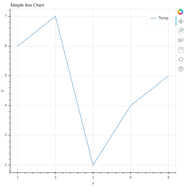
As you can see, we created a simple line chart.
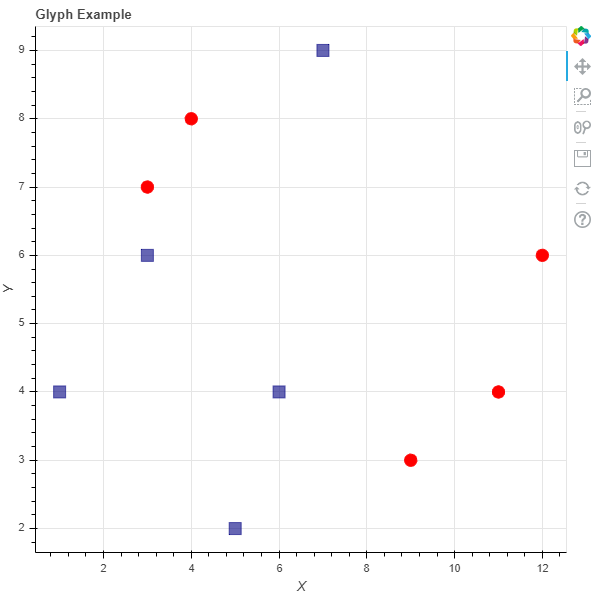
Plotting with BasicGlyphs
Let’s create a glyph chart. Let’s define the sizes of the chart in this example.
# Figure object and Defining tags
p = figure(plot_width = 600, plot_height = 600,
           title = 'Glyph Example',
           x_axis_label = 'X', y_axis_label = 'Y')

# Sample Data
squares_x = [1, 3, 6, 5, 7]
squares_y = [4, 6, 4, 2, 9]
circles_x = [9, 11, 4, 3, 12]
circles_y = [3, 4, 8, 7, 6]

# Creating a square glyph
p.square(squares_x, squares_y, size = 12, color = 'navy', alpha = 0.6)
# Create a circle glyph
p.circle(circles_x, circles_y, size = 12, color = 'red')

# Defining the plot as a n output in the Notebook
output_notebook()
# Show figure
show(p)
We can create our graphs with different glyphs. These;
- asterisk()
- circle()
- circle_cross()
- circle_x()
- cross()
- dash()
- diamond()
- diamond_cross()
- inverted_triangle()
- square()
Working with Categorical Data
Let’s create a barchart based on the world cup win numbers below.
output_file("cups.html")

# Creating a list of teams that won the world cup
teams = ['Argentina', 'Brazil', 'Spain', 'Germany']

# World cup win numbers
wc_won = [2, 5, 1, 4]

# toolbar_location=None and tools=""
# hide tools to the right of the chart
p = figure(x_range=teams, plot_height=250, title="World Cup Win Numbers",
           toolbar_location=None, tools="")

# define barchart
p.vbar(x=teams, top=wc_won, width=0.5)

p.xgrid.grid_line_color = 'red'
p.y_range.start = 0

show(p)
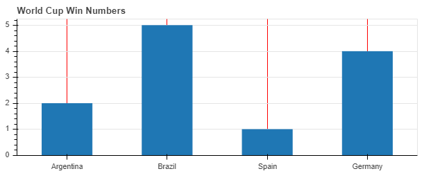
We defined the starting point of our y axis with p.y_range.start in the barchart chart.
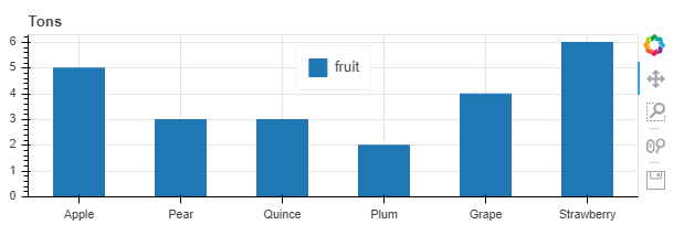
ColumnDataSource Object Usage
Bokeh uses the ColumnDataSource object to deal with data from sources such as Python dictionary and Pandas DataFrames.
Bokeh Python dictionary ve Pandas DataFrames’ ler gibi kaynaklardan gelen veriler ile baş edebilmek için ColumnDataSource objesini kullanır. With this object, we can show our plot easily.
# ColumnDataSource import etme
from bokeh.models import ColumnDataSource

output_file("fruit.html")
data = {
    'fruits':
    ['Apple', 'Pear', 'Quince', 'Plum', 'Grape', 'Strawberry'],
    '2015': [2, 1, 8, 3, 2, 4],
    '2016': [5, 3, 3, 2, 4, 6],
    '2017': [3, 2, 4, 4, 5, 3],
    'Alan': [10, 9 , 10 , 7 , 8 ,9]
}
#creating DataFrame
df = pd.DataFrame(data).set_index("fruits")

#Giving DataFrame as input to ColumnDataSource object
source = ColumnDataSource(data=df)
fruits = source.data['fruits].tolist()

#Create figure() object
barchart = figure(x_range=fruits,  plot_height=200, title="Tons")

barchart.vbar(x='fruits', top='2016', width=0.5, legend='fruit', source=source)

barchart.legend.orientation = "horizontal"
barchart.legend.location = "top_center"
barchart.y_range.start = 0

show(barchart)
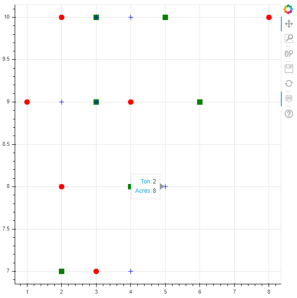
Making Interactions
If we want to make our chart a little more interactive, there is also a method in Bokeh. Explanatory information can be presented when navigating over the graph with the HoverTool feature.
# ColumnDataSource import etme
from bokeh.models import ColumnDataSource
from bokeh.models import HoverTool

output_file("fruit.html")
data = {
    'fruits':
    ['Apple', 'Pear', 'Quince', 'Plum', 'Grape', 'Strawberry'],
    '2015': [2, 1, 8, 3, 2, 4],
    '2016': [5, 3, 3, 2, 4, 6],
    '2017': [3, 2, 4, 4, 5, 3],
    'Alan': [10, 9 , 10 , 7 , 8 ,9]
}
#Creating a DataFrame
df = pd.DataFrame(data).set_index("fruits")

#Giving DataFrame as input to ColumnDataSource object
source = ColumnDataSource(data=df)
fruits = source.data['fruits'].tolist()

p = figure()
p.circle(x='2015', y='Alan', source=source, size=10, color='red')
p.square(x='2016', y='Alan', source=source, size=10, color='green')
p.cross(x='2017', y='Alan', source=source, size=10, color='blue')
#Using the hover feature
hover = HoverTool()
hover.tooltips=[
    ('Ton', '@2015'),
    ('Acres', '@Field')
]

p.add_tools(hover)

show(p)
If you want to do much more with Bokeh, you can visit the official website. In this article, I explained about Bokeh and the strengths of the Bokeh library.
Sources
- https://docs.bokeh.org
- https://realpython.com/python-data-visualization-bokeh/
- https://towardsdatascience.com/data-visualization-with-bokeh-in-python-part-one-getting-started-a11655a467d4
- https://codeburst.io/overview-of-python-data-visualization-tools-e32e1f716d10
- https://towardsdatascience.com/6-reasons-i-love-bokeh-for-data-exploration-with-python-a778a2086a95
- https://programminghistorian.org/en/lessons/visualizing-with-bokeh
- https://stackabuse.com/pythons-bokeh-library-for-interactive-data-visualization/