CSS ‘position’ Property and Use Cases
In CSS, position property is used to determine how an element is positioned on the web page. In other words, it defines the position behavior of the element on the web page. CSS position property can take up to 5 different values. These;
staticrelativeabsolutefixedsticky
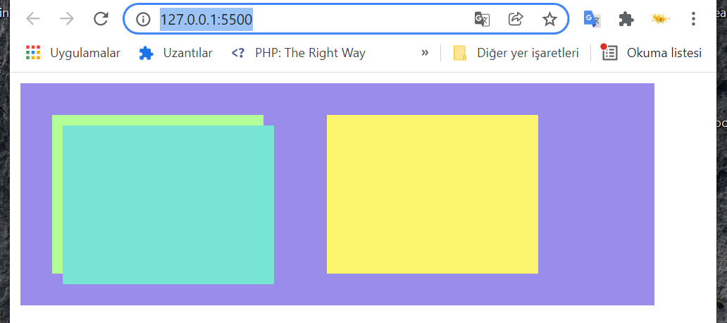
Now let’s see what effect these 5 values have on HTML elements. To see these effects, I prepared the following Html codes that have 3 boxes element and parent element.
 <!DOCTYPE html>
<html lang="en">
<head>
    <meta charset="UTF-8">
    <meta http-equiv="X-UA-Compatible" content="IE=edge">
    <meta name="viewport" content="width=device-width, initial-scale=1.0">
    <title>Document</title>
    <style>
        /* Reset style */
        html, body, div, span, applet, object, iframe,
        h1, h2, h3, h4, h5, h6, p, blockquote, pre,
        a, abbr, acronym, address, big, cite, code,
        del, dfn, em, img, ins, kbd, q, s, samp,
        small, strike, strong, sub, sup, tt, var,
        b, u, i, center,
        dl, dt, dd, ol, ul, li,
        fieldset, form, label, legend,
        table, caption, tbody, tfoot, thead, tr, th, td,
        article, aside, canvas, details, embed,
        figure, figcaption, footer, header, hgroup,
        menu, nav, output, ruby, section, summary,
        time, mark, audio, video {
            margin: 0;
            padding: 0;
            border: 0;
            font-size: 100%;
            font: inherit;
            vertical-align: baseline;
        }
        /*POSITION EXAMPLE STYLE */
        .parent-box{
            margin: 10px;
            width: 600px;
            height: 210px;
            display: flex;
            justify-content: space-between;
            background:  #998CEB;
        }
        .box-1{
            margin: 30px;
            width: 200px;
            height: 150px;
            background-color:#B4FE98;
        }
        .box-2{
            margin: 30px;
            width: 200px;
            height: 150px;
            background-color:#77E4D4;
        }
        .box-3{
            margin: 30px;
            width: 200px;
            height: 150px;
            background-color:#FBF46D;
        }
    </style>
</head>
<body>
    <div class="parent-box">
        <div class="box-1">
        </div>
        <div class="box-2">
        </div>
        <div class="box-3">
        </div>
    </div>
</body>
</html>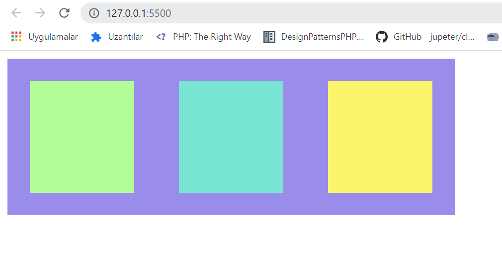
1-) Static :
HTML element is positioned in its normal flow position on the Web page. The position property of HTML elements is static by default. It does not respond to the top, bottom, left, right, and z-index CSS properties.
2-) Relative :
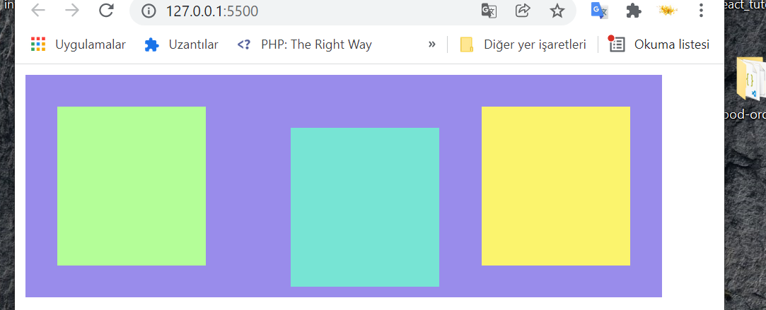
When we define position:relative property to the html element , it repositions according to its normal position. The element continues to take place in the normal flow of the web page, and no other element can occupy its place. In the code below, we have made the position property of the box-2 box relative. As seen in the picture, it has moved 20px down and to the right from its normal position.
.box-2{
            margin: 30px;
            width: 200px;
            height: 150px;
            background-color:#77E4D4;
  /*position: relative example*/
            top:20px;
            left:20px;
            position: relative;
        }
3-) Absolute:
When we define position:relative property to the html element, it repositions according to its normal position. The element continues to take place in the normal flow of the web page, and no other element can occupy its place. In the code below, we have made the position property of box-2 box relative. As seen in the picture, it has moved 20px down and to the right from its normal position.
.box-2{
            margin: 30px;
            width: 200px;
            height: 150px;
            background-color:#77E4D4;
  /*position: relative example*/
            top:20px;
            left:20px;
            position: absolute;
        }
4-) Fixed:
When we define position:fixed property to the html element, the element exits the normal flow of the web page. The position of the web page visible on the screen (viewport) is determined according to top, bottom, left, right and z-index CSS properties. The element will remain on the screen even if the display window is scrolled.
Viewport: the user’s visible area of a web page.
For example, on web pages, back to button can be done with the position:fixed property.
<style>
  .back-to-top {
            position: fixed;
            right: 2rem;
            bottom: 2rem;
            padding: 10px;
            border-radius: 5px;
        }
</style>
<body>
    <button class="back-to-top">Back To Top</button>
</body>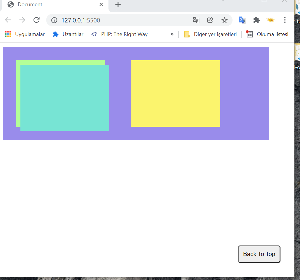
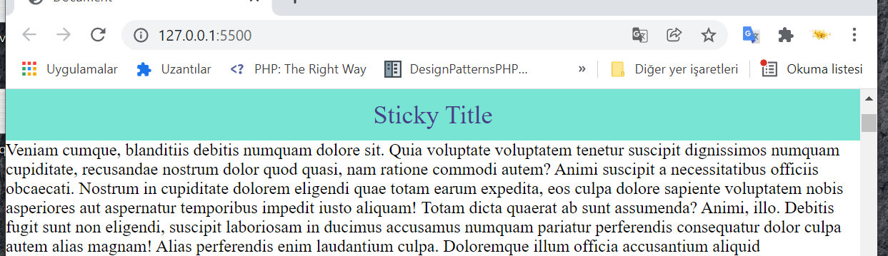
5-) Sticky:
When we define position:sticky property to the html element, element will keep its normal position until the scroll bar comes, and when the scroll bar comes, it will act as position:fixed on viewport.
<style>
  .sticky-element{
            text-align: center;
            background-color: #77E4D4;
            padding: 10px 0px;
            font-size: 24px;
            color:darkslateblue;
            position: sticky;
            top: 0;
        }
</style>
<body>
    <h1 class="sticky-element">Sticky Title</h1>
</body>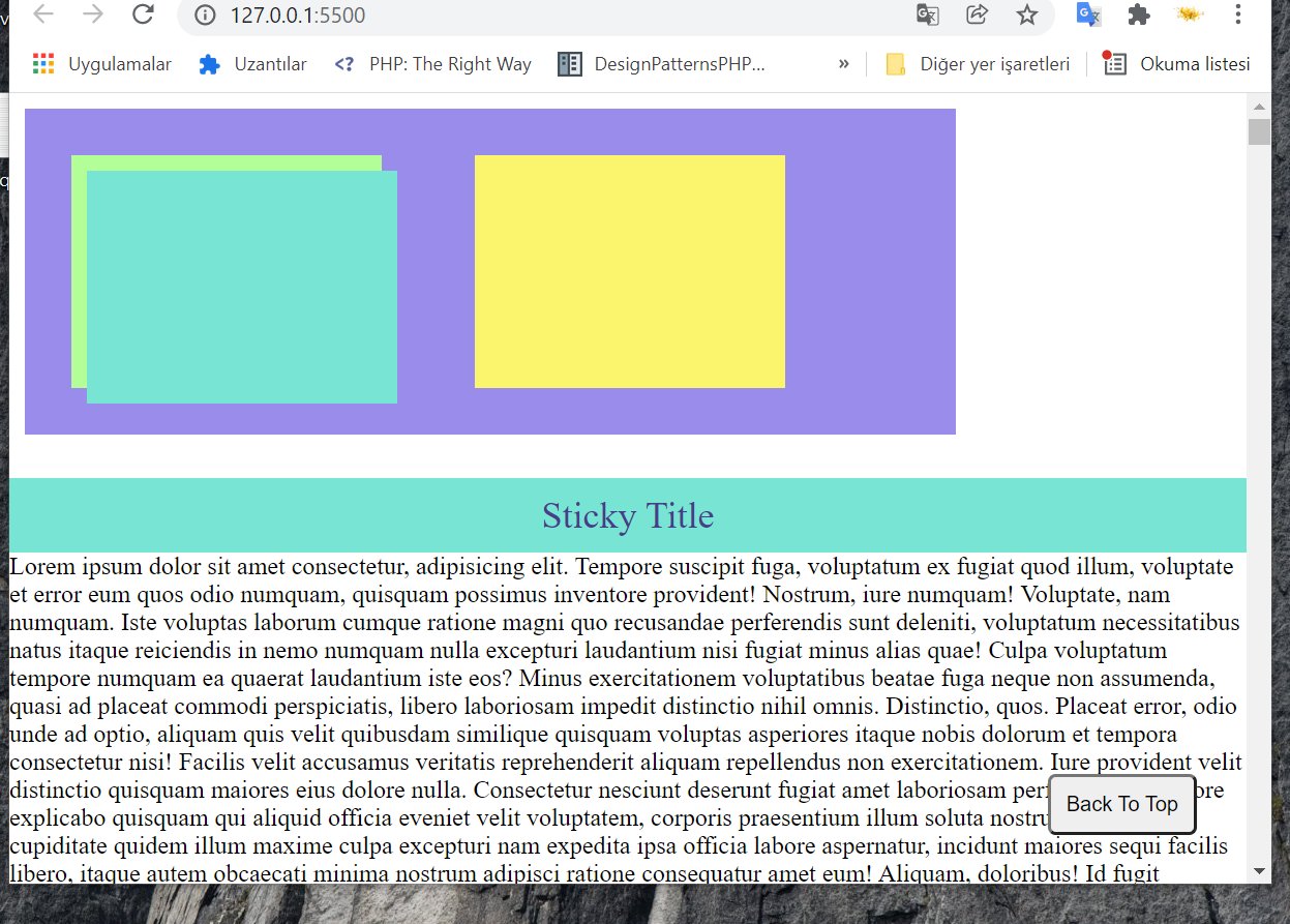
As seen in the picture below, when the scroll bar is moved down, sticky defined element stays on the top of the screen.
In this post, I explained the frequently used and confusing position property in CSS.
Good Luck …