Data Visualisation on Top of Choropleth Map Using Python Folium
While analyzing data, we can enrich our visuals by using Maps along with our charts. We will see how we can visualize our data on Top of Choropleth Map using the Folium package in Python.
The Folium package uses the JavaScript leaflet.js library in the background.
In the examples in this post, the choropleth map of the European Union countries will be used as a map. You can download the map data from the link https://github.com/etemkeskin/data_analyse/blob/master/europe_union/european-union-countries.json .You can try the examples in this post on jupyter notebook.
If you do not have a folium package on your computer, you can install it with pip install folium.
First, we import the python packages to be used in the project.
import json
import folium
import numpy as np
import pandas as pd
Then, load our map data from the file to our project. The json structure of the map is important. You can create your own geojson file for the map from https://geojson.io/.
geo_str = json.dumps(json.load(open("european-union-countries.json", 'r'))) # map data
We can create our map by writing the codes below. Since we will be using the map of Europe to determine where the map will start first, we have given the coordinates of Munich. We also set the zoom value to 3.
mapeu = folium.Map(location=[48, 11], # Munich coordinates
                  tiles="Mapbox Bright",
                  zoom_start=3)
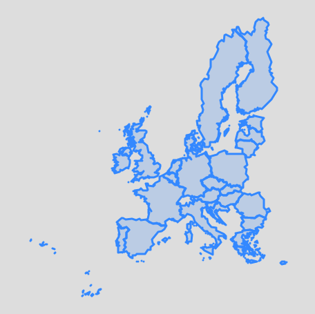
We get our first choropleth map by adding GeoJSON data to our map.
folium.GeoJson(
    geo_str,
    name='geojson'
).add_to(mapeu)
mapeu
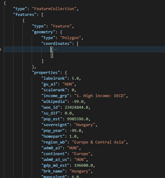
We will add data to this map and color them according to the populations of the countries. Estimated population data of European countries are also included in the european-union-countries.json file. We create a dataframe from our json file by running the codes below.
# Data preparation
json_dict= json.load(open("european-union-countries.json", 'r'))
df = pd.DataFrame([])
for i,j in enumerate(json_dict["features"]):
    df = df_all3.append(pd.DataFrame(j["properties"], index=[i]))
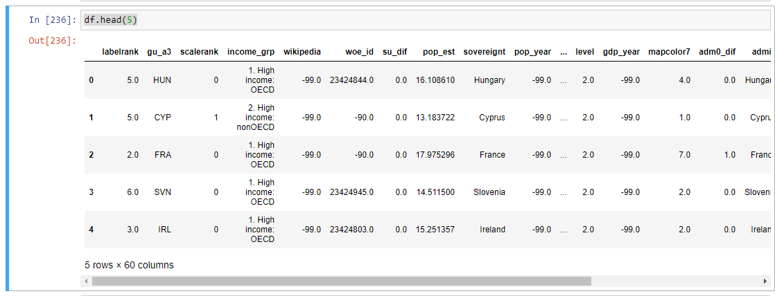
df.head(5)
We can see the structure of the dataframe below;
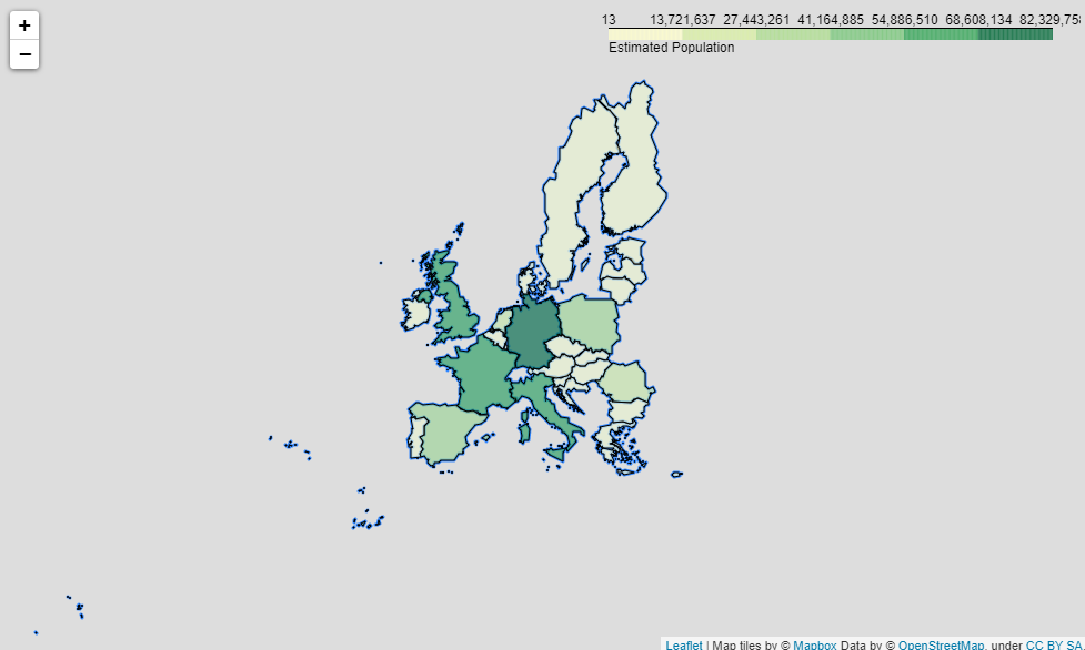
We will use 7 color segments based on population on the map. For this color scale, we create a list by population.

Now we can see the population distribution of the European Union countries on the map. In the code below, we match the country code column in the Datafram with the country code in the json file.
folium.Choropleth(
            geo_data=geo_str, # map data
            data=df, # dataframe
            columns=['gu_a3','pop_est'], # used columns
            fill_color='YlGn',
            key_on='feature.properties.gu_a3',#geojson country code
            bins = scale, #color scale
            legend_name='Estimated Population'
                        ).add_to(mapeu)
mapeu
SOURCES
- https://geojson.io/
- https://www.openstreetmap.org/
- https://python-visualization.github.io/folium/quickstart.html
One thought on “Data Visualisation on Top of Choropleth Map Using Python Folium”
Leave a Reply
You must be logged in to post a comment.
Good job linking to json that has all the countries switched up. Otherwise useful tutorial.